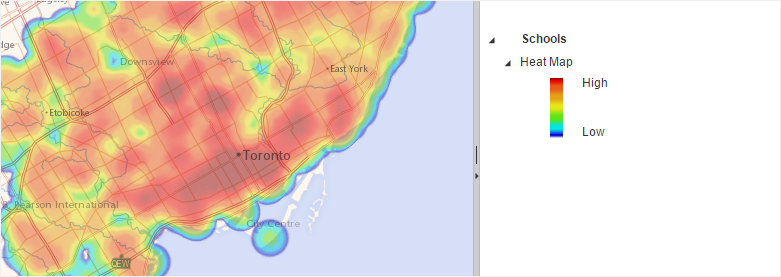
Heat Map
This type of thematic analyse uses a gradient of colors to display the geographic distribution of a point layer. In general, low density areas are represented with cold colors (blue, green) while areas of higher density are displayed with warmer tones (yellow, orange, red).
Heat Map showing the density of a point layer
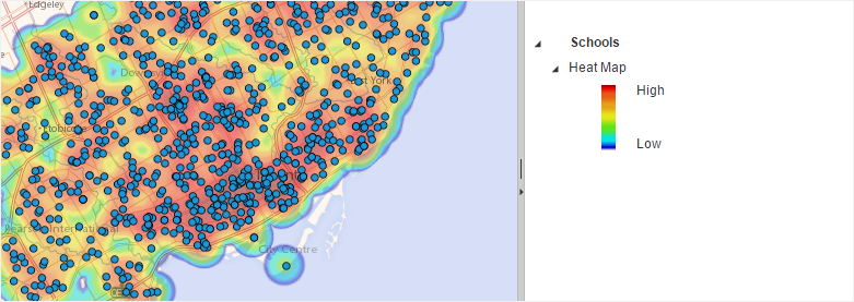
Heat Map with Features Visible
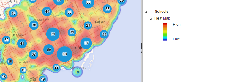
Heat Map with Features Visible in Data Clusters
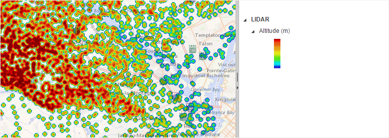
Heat Map showing the intensity of a thematic data
Legend Settings
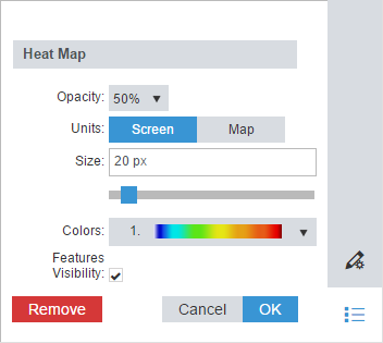
When this thematic analysis is displayed, the Legend Settings are accessible from the Legend panel to customize the thematic analysis name, opacity and the following settings: