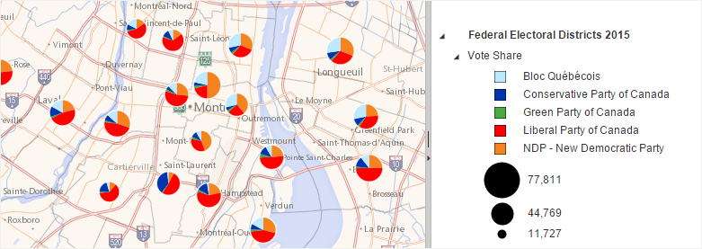
Pie Charts

This type of thematic analysis adds a pie chart at the centroid of every map feature. It is applicable to point, polyline or polygon layers with numeric data.To have access to this type of thematic analysis, you must select multiple thematic data with the same data unit. Each thematic data will be represented with a unique color. The area of each sector will indicate the category's relative importance in relation to others.

Points, Polylines or Polygons

Legend Settings

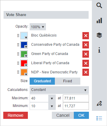
When this thematic analysis is displayed, the Legend Settings are accessible from the Legend panel to customize the thematic analysis name, opacity and the following settings:

Drag and drop the handles of a category to change the legend order.

Set the color.

Rename the legend item.

Restore the default text for the legend item.

Click Graduated to access to the graduated size settings.

Select one of the scaling methods available to define the charts size from the drop-down list.

Scale the charts size linearly.

Scale the charts size logarithmically (base 10).

Scale the charts size by square root.

Select the charts maximum size from the drop-down list or type the desired size in the text box.

Select the charts minimum size from the drop-down list or type the desired size in the text box.

Modify manually the maximum and minimum values by typing a number in the text box.

Click Fixed to access to the fixed size settings.

Select the charts size from the drop-down list or type the desired size in the text box.