Color Picker
The Color Picker dialog gives you a wide array of options to define the perfect color for your map's features, labels and background. This dialog is divided in the following sections:
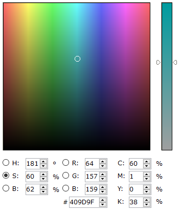
- Color Gradient Box
- HSB - Hue / Saturation / Brightness
- RGB - Red / Green / Blue
- CMYK - Cyan / Magenta / Yellow / Black
- Theme Colors and Standard Colors
- Custom Colors
- Color Picker
- Accessibility
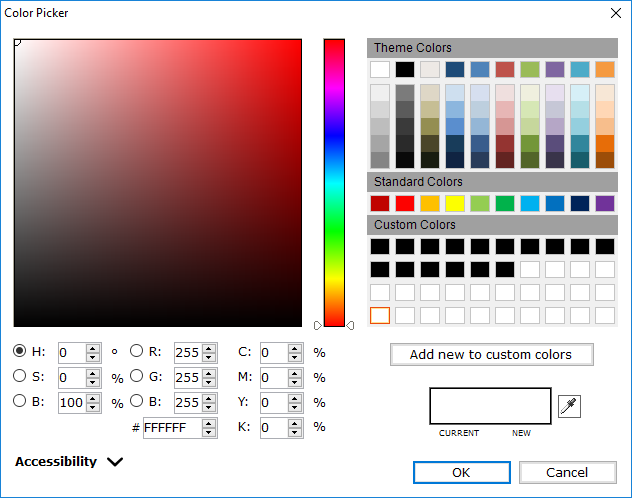
Color Gradient Box
Click and drag the white circle. The three different ways to represent a color numerically (HSB, RGB and CMYK) will adjust automatically. You can also adjust specific aspects of the color using the properties below the gradient box. Edit a value directly or use the radio buttons. To select the aspect to appear in the slider bar to the right of the color gradient box.
HSB - Hue / Saturation / Brightness
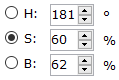
Hue is a degree on the color wheel from 0° to 360°: 0° is red, 120° is green, 240° is blue.

Saturation is a percentage value: 0% means a shade of gray and 100% is the full color.

Brightness is a percentage value: 0% is black, 100% is white.

RGB - Red / Green / Blue
Each parameter defines the intensity of the respective color as an integer between 0 and 255. Computer screens display colors using RGB color values.

The RGB values can be represented as a single hexadecimal value. A value is specified using #RRGGBB with RR (red), GG (green) and BB (blue) hexadecimal values between 00 (lowest value) and FF (highest value).

CMYK - Cyan / Magenta / Yellow / Black
Each parameter defines the intensity of the respective color as a percentage between 0 and 100. Printers often present colors using CMYK color values.

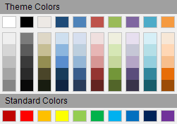
Theme Colors and Standard Colors
Select one of the predefined Theme Colors or Standard Colors.
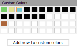
Custom Colors
Select one of your own Custom Colors. Select a color box in the Custom Colors section, create a color using the color gradient box or the color codes and click Add New to Custom Colors to save a color you wish to reuse in the future.
Color Picker

Click and hold on the eyedropper icon. Then move the mouse around your screen. The color under the mouse appears in the top portion of the pop-up and a magnified view of where the mouse appears in the bottom portion.
![]()
Accessibility
About 8% of men and 0.5% of women are born with some form of colorblindness. Use the Accessibility options to assist in selecting colors.
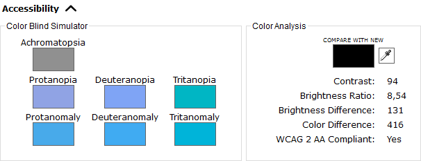
Color Blind Simulator
Use the Color Blind Simulator to visualize how users with a specific visual disorder will see the selected color.
| Visual Disorder | Description | Population affected |
Simulation |
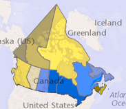
Normal Vision |
|---|---|---|---|---|
|
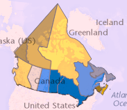
Achromatopsia |
Total color blindness | Very rare |
|
|
|
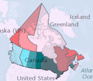
Protanopia |
Red blindness | 1% of men |
|
|
|
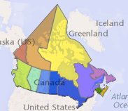
Deuteranopia |
Green blindness | 1% of men |
|
|
|
Tritanopia |
Blue blindness | Less than 1% of men and women |
|
|
|
Protanomaly |
Red weakness |
1% of men, 0.01% of women |
|
|
|
Deuteranomaly |
Green weakness |
6% of men, 0.4% of women |
|
|
|
Tritanomaly |
Blue weakness | Less than 0.01% of men and women |
|
|
Color Analysis
Use the Color Analysis statistics to obtain a color respecting the Web Content Accessibility Guidelines (WCAG) 2.0 level AA.
- Contrast: Ratio between the foreground color and background color using the color luminance values.
- Brightness Ratio: Color brightness is determined by the following formula:
((red value X 299) + (green value X 587) + (blue value X 114)) / 1000
Note: This algorithm is taken from a formula for converting RGB values to YIQ values. This brightness value gives a perceived brightness for a color. The rage for color brightness difference is 125. - Brightness Difference: You get a brightness difference by subtracting the brightness value of the background from the brightness value of the text:
text brightness - background brightness = brightness difference
If the background is brighter then the text, for example black text on white, then the brightness difference will, of course, be a negative number. With 10 pt text results that are outside of a range of -80 to 80 in the brightness difference are moderately readable. - Color Difference: Color difference is determined by the following formula:
(maximum (red value 1, red value 2) - minimum (red value 1, red value 2)) +
(maximum (green value 1, red value 2) - minimum (green value 1, red value 2)) +
(maximum (blue value 1, red value 2) - minimum (blue value 1, red value 2))
The range for color difference is 500. - WCAG 2 AA Compliant: The color contrast ratio changes from 1:1 (no contrast, e.g., black text on a black background) to 21:1 (maximum contrast, e.g., black text on a white background). To be AA compliant, the ratio must be 4,5:1 or more.