Create an amazing interactive experience for your users
Onboarding
Intuitive in-app tours that show you how CartoVista works, one step at a time.
Modern UX
A better UX and enhanced user interface interactions (rollover, datatips, etc.) helps users comprehend your data.
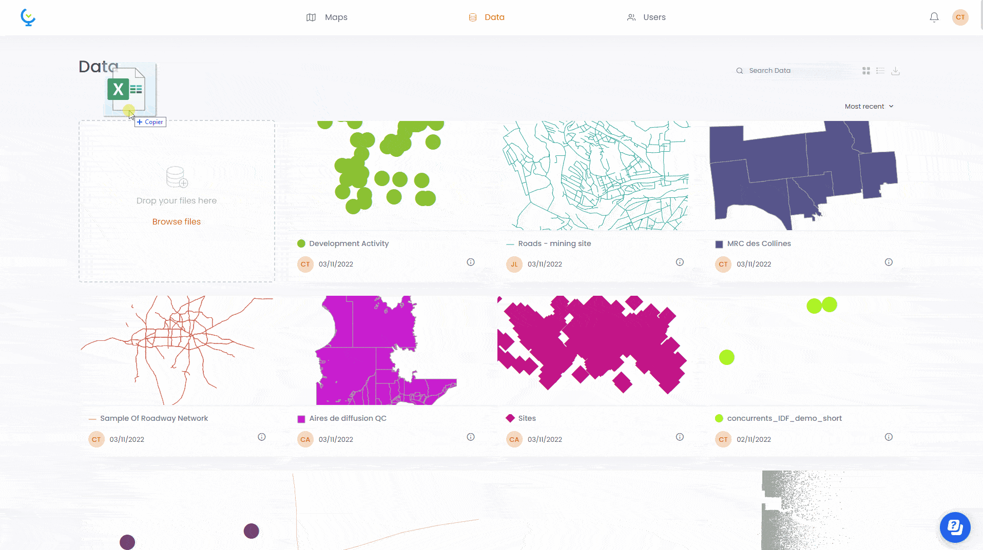
Drag & drop data viz
Drag and drop your ESRI Shapes, MapInfo tables, Excel and CSV files to create a map and visualize your data.
Full mobile support
Fully responsive interface designed to adapt to the display capabilities of all mobile devices.
Presentation slides
Create slide presentations that include rich data views and answers to questions.
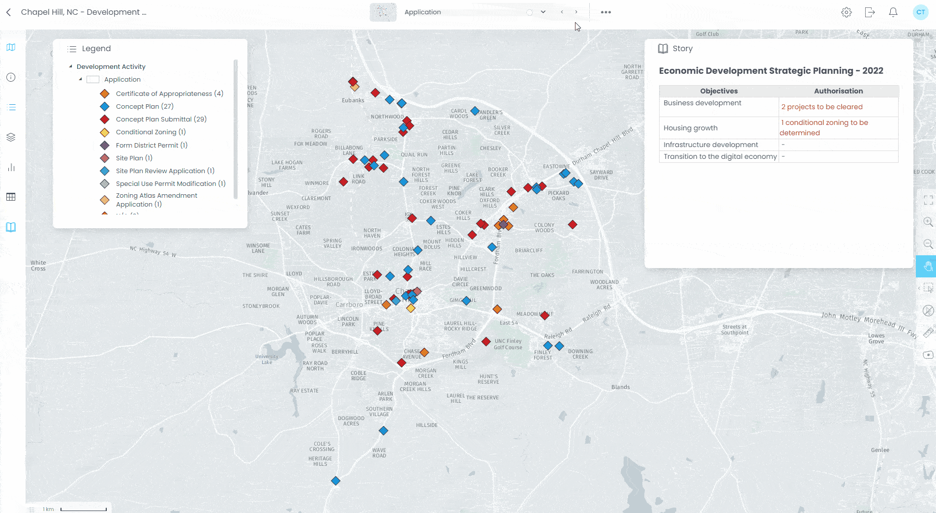
Information popups
Empower your users with clickable map features to get all the associated attribute information in one go. Allow them to configure and choose which columns are displayed.
Dashboarding
Organize your dashboard panels easily (panel layout, full screen map, etc.).
Story panels
Create presentation slides that tell a story, edit your content inline with simplicity.
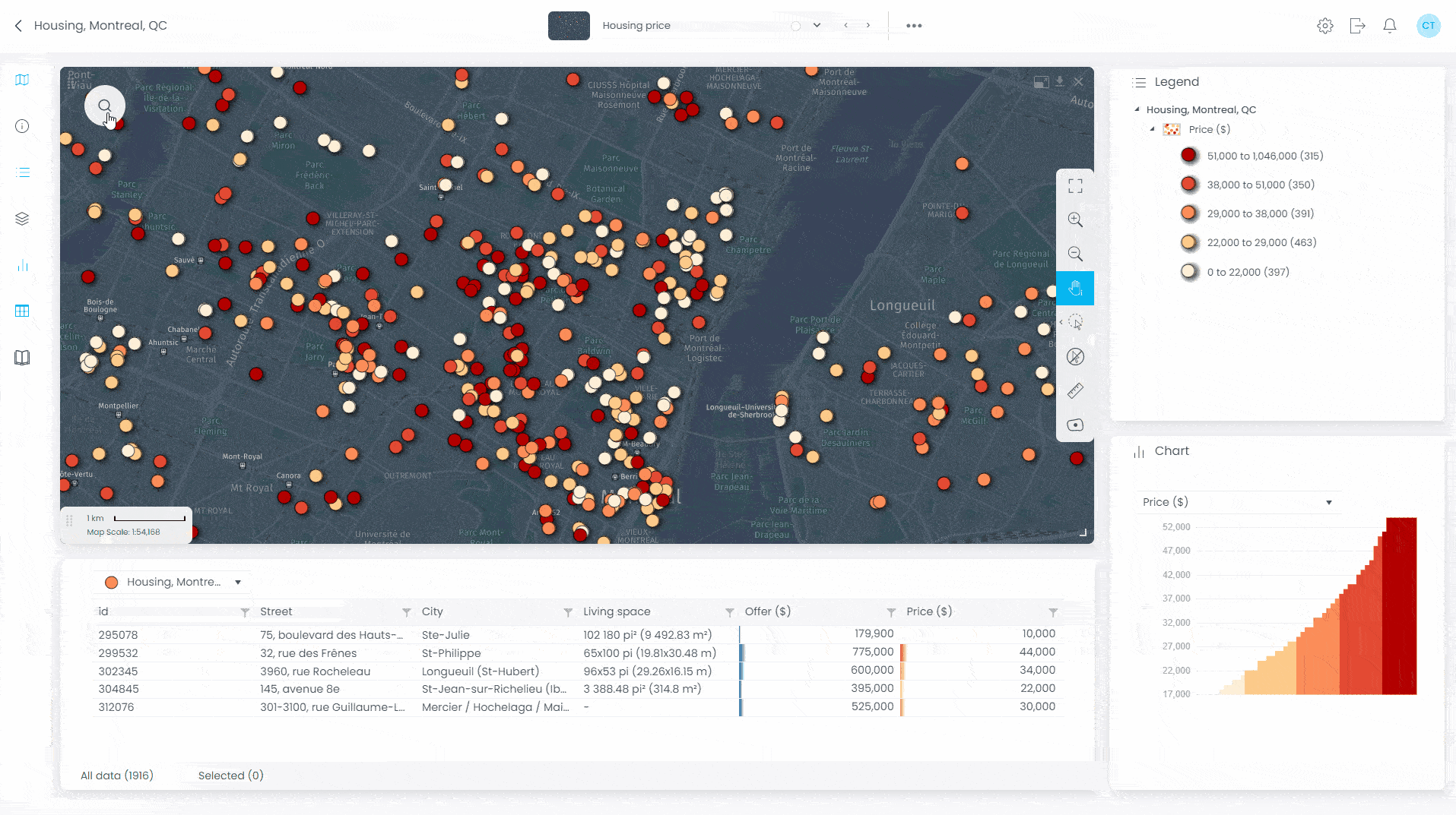
Data tables
Expose your data with interactive tables that have filtering, sorting, statistics, etc., display the underlying map data clearly for your end users.
Multimedia
Add relevant images or video content to your map features. Create powerful associations with hyperlinks.
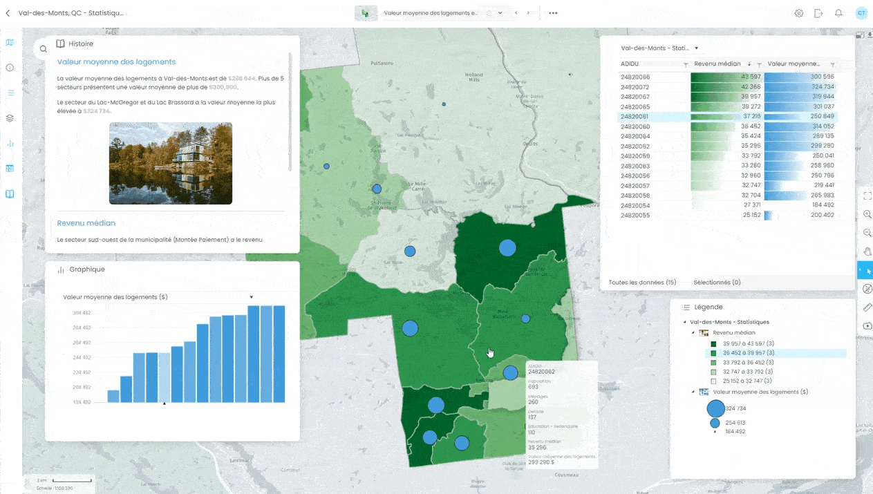
Interactive charts
Show your data graphically and allow users to discover the information behind the data.
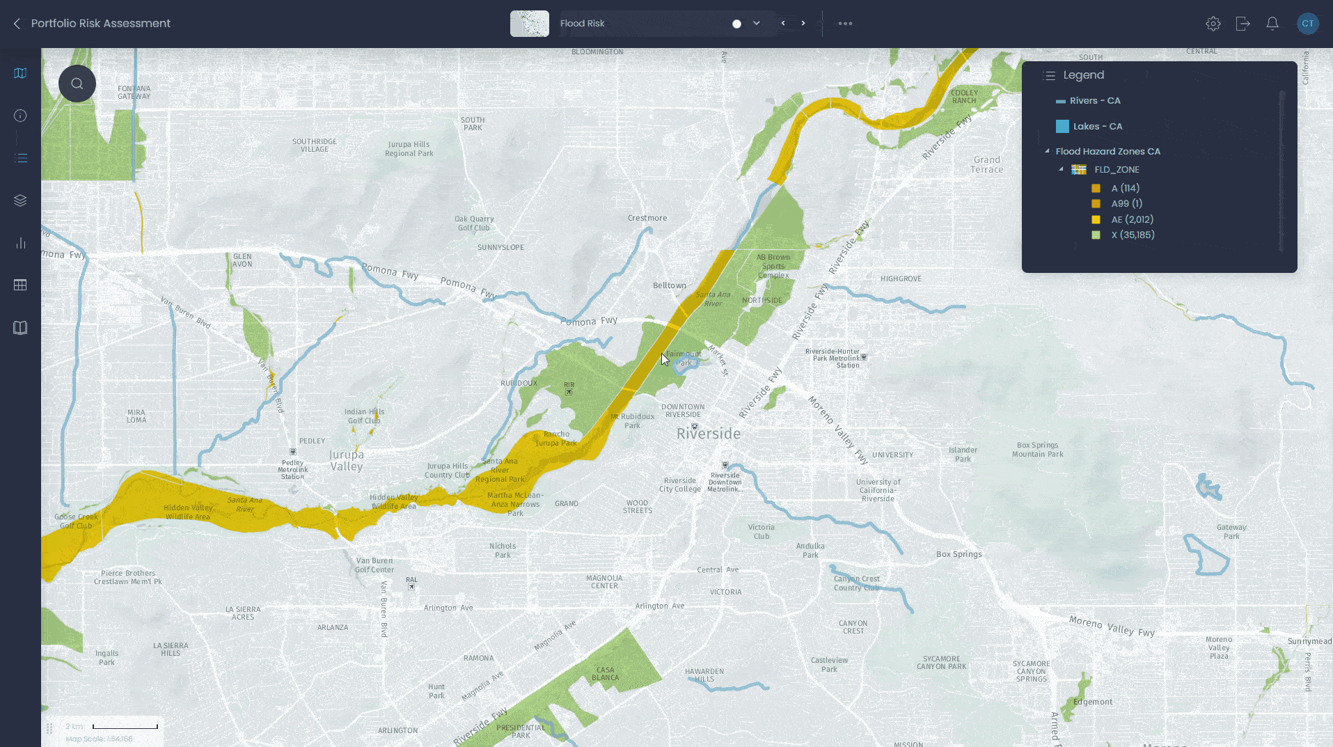
Layer control
Manage layers (visibility, labels, order, etc.) and their properties easily.
Rendering
Prepare better looking distinctive web maps, make you data beautiful with photoshop-like effects (drop shadow, outer glow, blend mode, etc.)
Basemaps
Choose an appropriate base map from a collection of over 70 tile providers.
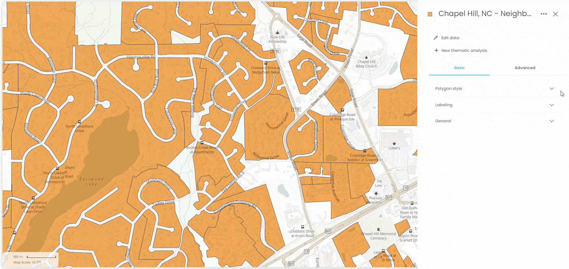
WYSIWYG design
Change layer styles and labels and see the result immediately on your map (WYSIWYG).
Interactivity
Setup rich interactions and see the result immediately on your map (datatips, rollover, etc).
Light / dark mode
Choose between a modern light or dark mode interface style
Muti-language
Reach your user in their preferred language: (English, French, Spanish, Italian, Portuguese and German)
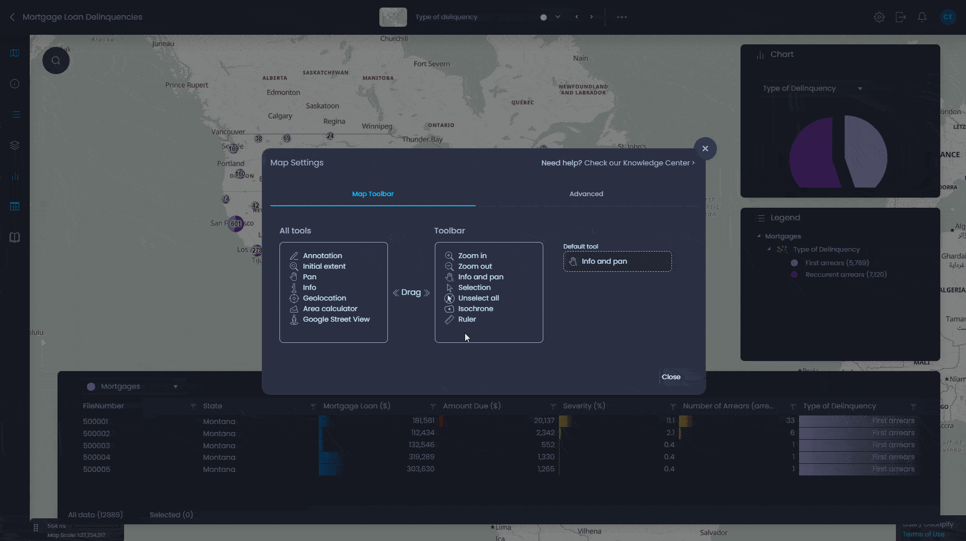
Map UI & interface
Benefit from more than 50 options to help you define the user interface and tools needed
Print layouts
Create great PDF print outputs, integrate your company logo and create an appropriate print layout that can easily be exported to Adobe PDF format.
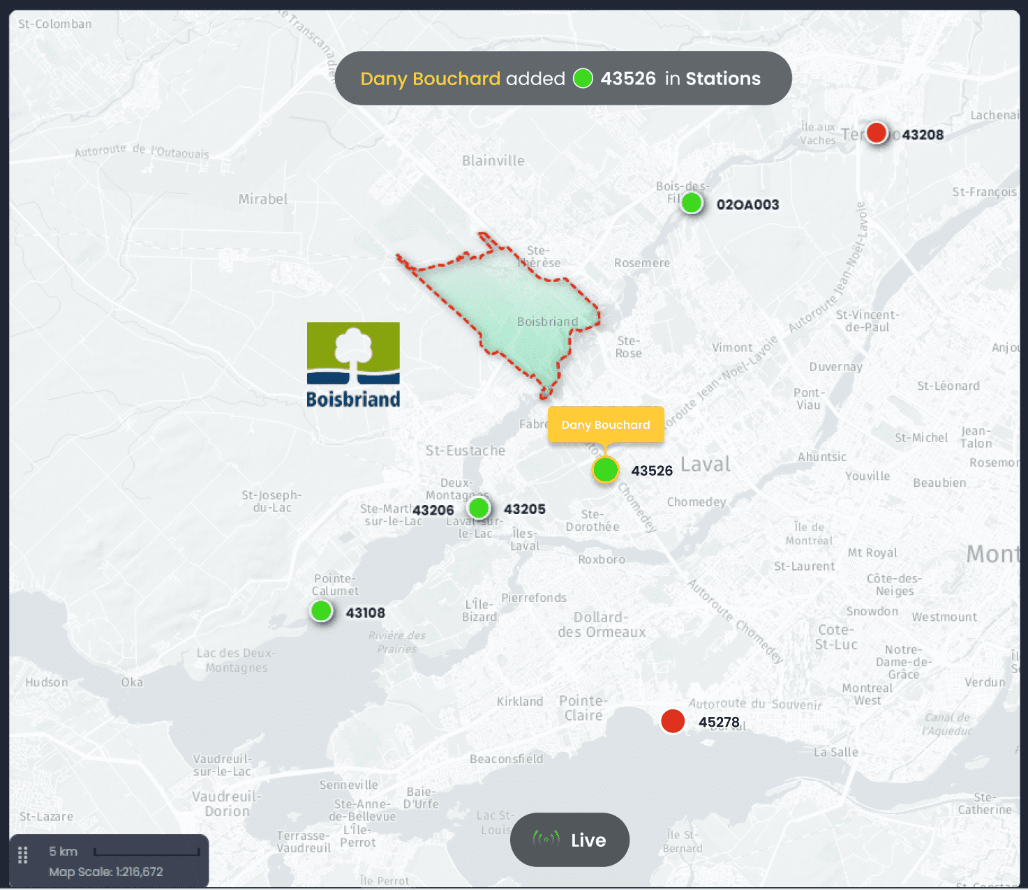
Live data stream
Connect map features to live data that is updated in real-time.
Update notifications
Get user friendly notifications of data updates as they occur.
Data editing and collaboration
Work as a team on shared datasets and see live changes.
Real-time insights
Connect with operational information from IoT devices, assets, or vehicles in the field to get strategic insights.
Upload, analyze and manage your data in the cloud
Search
Search through the layers on the map using keywords, search by address, postal code or any geographic name (NOTE: Service provided by HERE maps)
Download data
Allow users to download the map data in a usable format (Excel) or copy it to the clipboard
Selection tools
Empower data analysis by selecting features from the map (direct selection, circular, rectangular, polygonal), legend, chart or data table. Choose which columns are displayed in the table view.
Raster grid & Time series analysis
Analyze raster grid data with profile tools. Integrate time-based data and many-to-one datasets, analyze data over time (Coming in CartoVista 8.1).
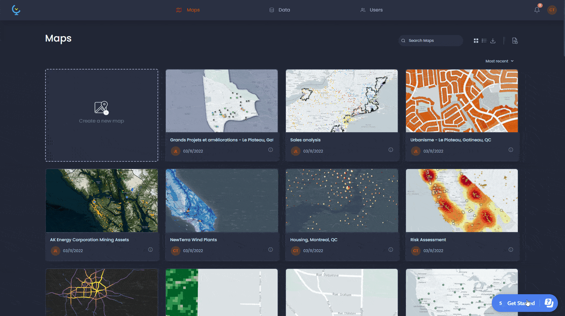
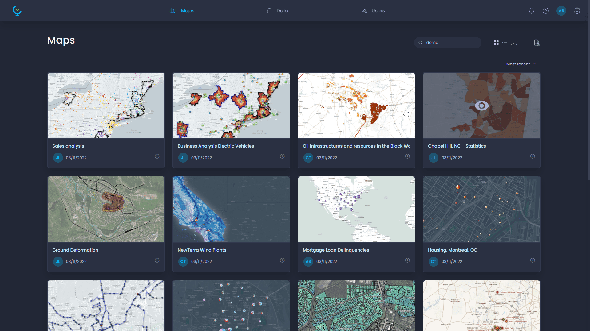
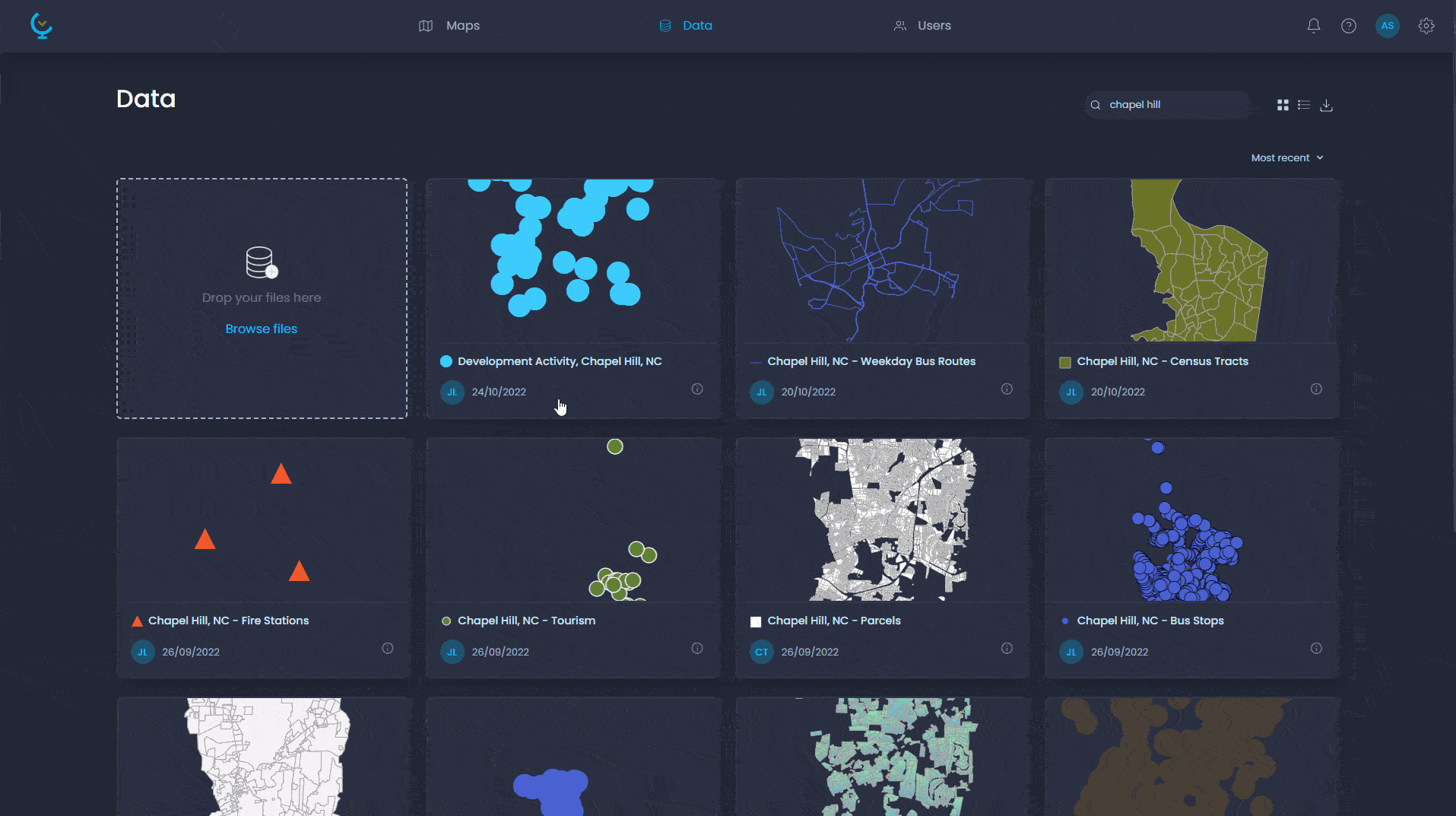
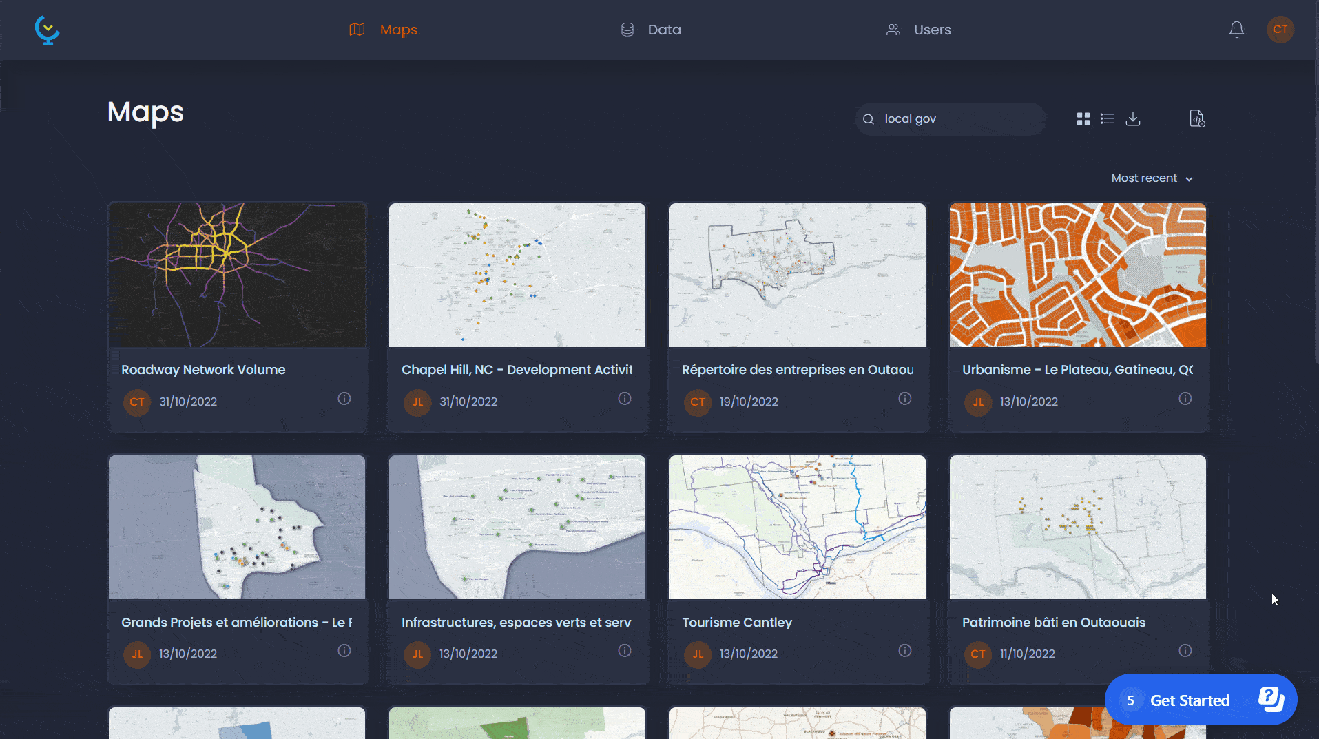
Map & data gallery
Create a searchable map and data gallery in your portal that facilitates access to your projects.
GIS data (.SHP, .TAB)
Upload your GIS data (in ESRI Shapefile - .SHP) or MapInfo Tables (.TAB) and configure its properties.
Spreadsheet (.XLS, CSV)
Upload your spreadsheet data (Microsoft Excel - XLSX, CSV, etc.) and configure its properties.
Geotiff (.TIF)
Upload raster images data and configure properties. Create raster grid time series. (Coming in CartoVista 8.5)
Geocode by latitude - longitude
Geocode your spreadsheet data from latitude & longtitude fields.
Geocode by address
Geocode your spreadsheet data from address fields.
Linking data
Link your spreadsheet data to existing layers.
Edit data online
Edit layer features (attribute and geospatial) directly in the map.
Users
Create and manage users and groups, setup roles and permissions.
Permissions
Assign view and edit permissions to maps and data easily.
Public maps
Allow to create maps that can be accessed publicly without having to log-in to the platform (anonymous users).
Data download
Allow users to download data layers in ESRI Shapefiles (.SHP) format.
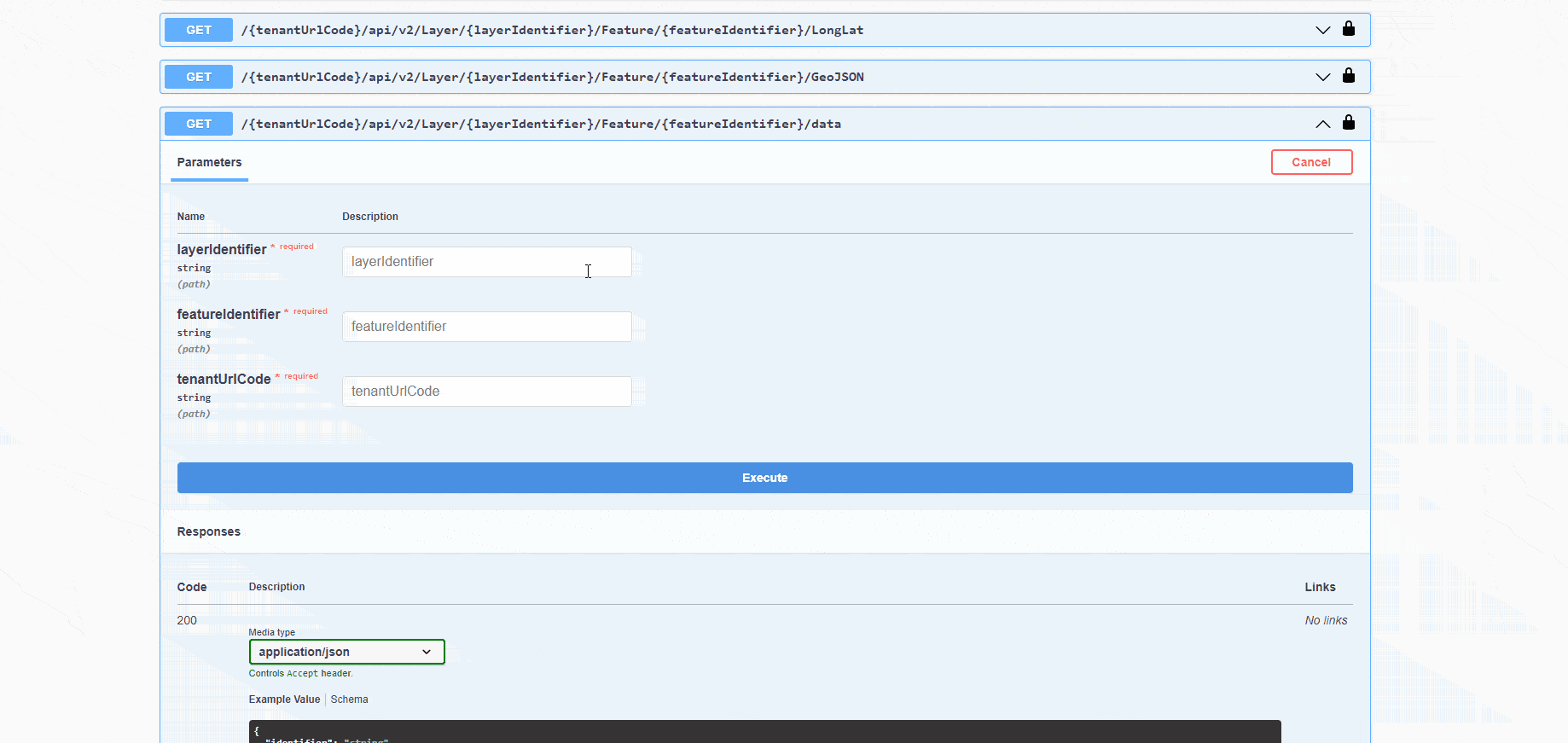
Data automation with REST API
Setup automatic tasks (data updates, etc) with the CartoVista REST API.
Portal branding
Customize the interface color scheme and integrate your company branding and logo.
Enterprise Single Sign On (SSO)
Setup single-sign-on (SSO) for your enterprise users using OpenID Connect.
More tools and support for better decision making
Drawing and annotation tools
Add features with the drawing toolbar (text, line, polygons, etc.) easily on the map. Save and share annotations between users.
Drive-time isochrones
Choose the transportation mode, departure time to add drivetime polygons to your map from a specific location (note: Service provided by HERE Maps).
Spatial intersection
Select map features based on spatial relationship (e.g. points within polygon layers) NOTE: Coming soon in 2024.
Routing tools
Route from origin to destination, find the nearest points from layer.
Composite variable scoring
Create scoring analysis based on multiple variables with weighting capabilities (Coming soon in 2024).
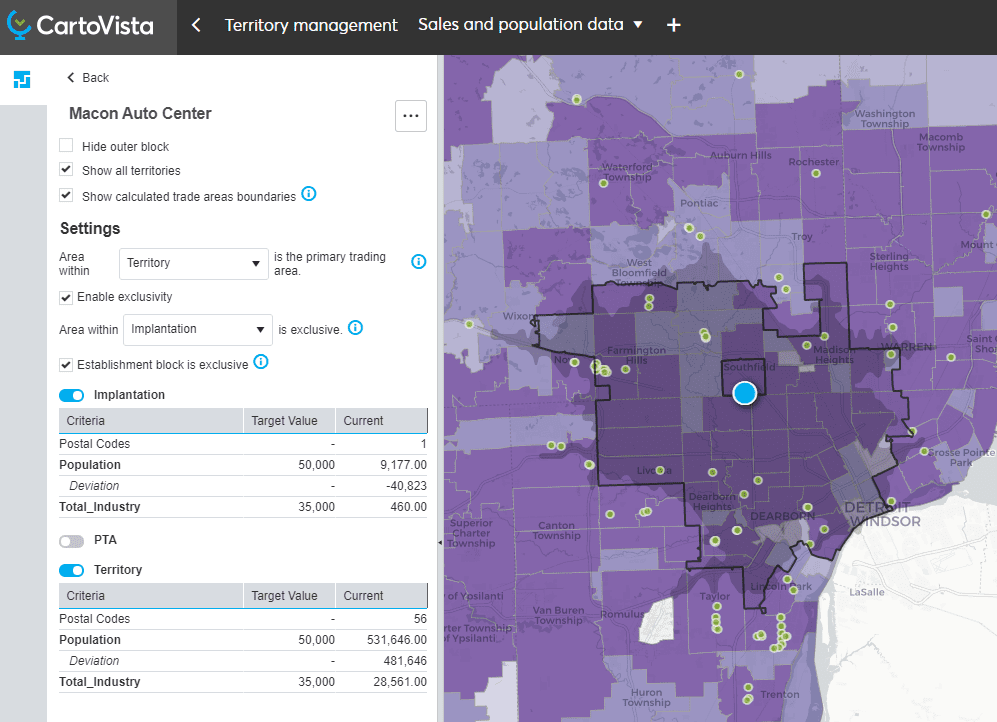
Territory manager
Create balanced territories using your own business information combined with key market data (demographics, industry, competition, etc.). Prepare compelling market reports for the franchises in your network (Coming in 2025).
In-app tours & feedback
Onboard with intuitive in-app tours and interact with us to send product feedback
Live chat
Chat with us directly in CartoVista to answer your questions.
Knowledge base
Access the CartoVista knowledge base with how to's and documentation.
Email support
Access technical support via email / submit questions and comments.
Try our professional plan for free
Ready to get started ?
- No obligation. No credit required